
And why it’s the only one you’ll need in your makeup bag.
This post comes from contributor, Katheryn Erickson.
You could spend your entire life searching for the perfect lipstick. But if you do, it’s probably because you never discovered Kosas. For much of my adult life, I rotated through a dozen plus shades that were never quite right for me. But those days are history. In fact, I have grown so attached to my tube of Stardust, the warm, petal-y-nude in the minimal collection of eight, that I feel genuine panic and clam up whenever I misplace it. From the creamy, hydrating texture to the colors that appear to flatter just about everyone, I have never met a more perfect lip product. Consider me obsessed. I am not alone.
There’s a reason Kosas is so great: Founder Sheena Yaitanes trained in portraiture and approaches color differently than your average trend-based makeup line. “The color process for me is really precise — I always approach it from the perspective of fine art and color theory,” Yaitanes explains. “I look at the human being and all of the colors that can come from human flesh. The point of Kosas is for the shades to look like an extension of your face, creating harmony and emphasizing your features without masking what’s naturally beautiful. I approach it in the same way as if I were creating skin tones for a portrait.” The latest: Yaitanes is bringing that same artistic sensibility to six blushes that are, unsurprisingly, just as dreamy as her now-cult lipsticks. But let her tell you about them…
Why she decided to make blush…
I love blush. A lot of times people will say that they don’t like lipstick and they don’t wear bold lipstick colors. That’s because they don’t know that they have to balance the overall look with blush — it’s what’s missing from the equation. When you add lipstick, what you’re doing is increasing the saturation in one part of your face. So, for example, you’re bringing up the red. If we don’t increase the saturation of our cheeks accordingly, the lipstick won’t fall into place. Blush was the next natural step for Kosas. You can now have the full look.
How she developed the ultra-flattering shades…
There aren’t a huge number of blushes that we need. A brand might have ten different colors and only one will be right. It’s important to find something with undertones that blend with your skin so the visual result is more of a flush and not an obvious “blush” look. That’s where the work was for me; I put a lot into getting the colors to that human place.
Skin can roughly be split into two categories: Warm and Cool. And you can see light, medium, and dark tones in both. With the blush we decided to do a warm, a cool, and a neutral [in both cream and powder formats]. Most often, you want to have a visual harmony in your appearance and it’s easiest to stick with colors that match your undertone. If you’re cool, pick the cooler shades, and if you’re warm, stick with the warmer colors.
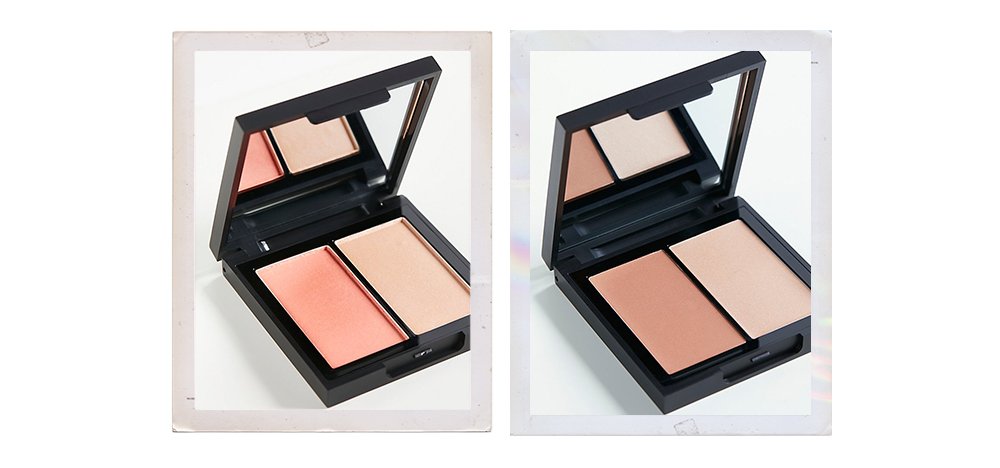
I was inspired by quality of light. With Contrachroma, the neutral bronze, I was thinking about the sun — when it’s just warming up and kissing your face. It can be used as a bronzer or for lightly sculpting and defining features. Papaya 1972 is a peach-based blush — it’s the quality of light through the filter of a 1970s beach. Longitude zero, the cool option, is the quality of north facing light. Northern light is muted and cool — it’s dimmer and shadowy. The creamy shades are similar in tone to the powder blushes, but have different personalities. They are meant to look fresh, juicy, and hydrate the apples of the cheeks. Velvet Melon is ripe and healthy, 8th Muse is innocent and classic, and Tropic Equinox is warm and bright.
Why she made both powders and creams — and was crazy-particular about texture…
When you’re choosing blush, look at your skin tone first. Then choose a formula for your skin type and the overall look you’re going for. Powders work much better for a person with oily skin because they’re mattifying, whereas creams work a lot better for someone with dry skin.
There’s seasonality to powder — there are times when you want to have a more polished, finished look. The Kosas powders aren’t at all cakey — when powder is cakey, it sits on top of your face and doesn’t look like it’s part of your skin. They’re blended with moringa and jojoba oils, and have an almost silky, cooling effect. The creams are rich rosehip, marula, green tea, and apricot kernel oils. They impart a dewy glow, but also absorb and “dry down,” so that skin feels hydrated, but not heavy. They work exceptionally well on bare skin, and the color provides a bit of coverage and evens out skin tone. They can just as easily be patted on over foundation for a natural overall look. The formula is incredibly soft and creamy, and blends seamlessly into skin. You won’t experience stickiness or overly-concentrated pigment.
Why she included a highlighter in each palette…
Highlighter has become very trendy lately, but I’ve always used it. There’s a fine art perspective to that, too: When you draw a balloon and you put that little highlight on it, you’re shaping it. You’re pulling out the shape by creating dimension. The same thing applies to your face, but you don’t have to go overboard (like some of the trends) because we aren’t pieces of paper; we are already three-dimensional. You can subtly shine a bit of light on your assets. I encourage women to identify those assets and emphasize them — look in the mirror, find what you like, and highlight that (rather than finding what you don’t like and trying to cover it).
Why you won’t see any sparkle…
The part of our face where we put blush is also where the pores are the largest. I will never understand shimmery blush. If we start putting sheen or glitter there, all those little grooves are going to get highlighted. The highlighters have a sheen, but you still won’t see any pieces of glitter.
Her favorite way to apply it…
I start with the highlighter. I’ll put some on the ridge of the cheekbone and up around the temple, then stop and take account. You want to avoid having that strip of highlighter on your cheek that doesn’t look blended. For blush, the best thing to do is to smile and identify the apple of your cheekbone. Once you find the middle, apply your blush beginning on the side farthest away from your nose. Concentrate the color there and then swoosh up and follow your highlighter, glazing over it. If you layer color, you’ll see the lightness coming through but it won’t look like a stripe. Next, take a large, fluffy brush and blend around the edges. That’s really important to having a natural blush look.
I also like to use the same blush brush and sweep a little bit of leftover color on my eyelids. Eyelid skin is really thin, and, when we age, we lose blood flow and natural color. A little bit of blush there warms up and brightens your face, and gives you a youthful glow.
I don’t think I’ll ever understand shimmery brush ever too!
Thanks for sharing the interview! ❤️
Charmaine Ng | Architecture & Lifestyle Blog
http://charmainenyw.com
Trusted Best sellers all at one place https://dealz.space/
Thank you for enlightening the blush subject, it was really helpfull :)
As Charmaine wrote, i don’t fully understand it yet. But this interview helped a lot.
I enjoyed your description of the colors and the differences between powder and creams. The colors are beautiful.
I liked how you described the colors and the contrasts between powders and creams.